· ReadyStack
Worked example
Real numbers from this tool, line by line.
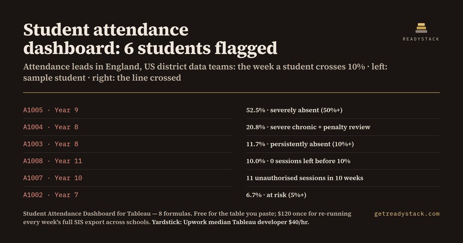
6 of 8 sample students are flagged — for attendance leads in England and US district data teams.
A1005, Year 9: 52.5% absent. Severe chronic (US), severely absent (DfE), 12 unauthorised sessions in 10 weeks. A1004, Year 8: 20.8% absent. Severe chronic, persistently absent, 10 unauthorised sessions, penalty review. A1003, Year 8: 11.7% absent. Moderate chronic, persistently absent. A1008, Year 11: 10.0% absent. Moderate chronic, 0 sessions left before the 10% line. A1007, Year 10: 9.2% absent. At risk, but 11 unauthorised sessions in 10 weeks, penalty review. A1002, Year 7: 6.7% absent. At risk, 4 sessions left. Not flagged: A1001 at 1.7% and A1006 at 4.2%, both satisfactory.
That is 4 students at or over the 10% line and 3 at the penalty screen, from 8 fictional students with 120 possible sessions each (12 weeks of 10 sessions).
Every Monday an attendance lead opens the same export and asks the same three questions. Who has crossed 10%? Who is close? Who has piled up enough unauthorised sessions that a penalty notice has to be considered? The workbook answers all three from your own CSV.
The lines are not the same on both sides of the Atlantic. In the US, Attendance Works sorts students into four tiers by the share of school days missed: under 5% is satisfactory, 5% is at risk, 10% is moderate chronic absence and 20% is severe chronic absence. In England, the DfE calls a pupil persistently absent at 10% or more of possible sessions and severely absent at 50% or more. Since 19 August 2024 England also has a national framework for penalty notices: 10 unauthorised sessions within a rolling 10 school weeks means a penalty notice must be considered, at 80 pounds per parent per child if paid within 21 days and 160 pounds within 28.
A1007 is the student a rate-only report misses: 9.2% absent, so no chronic flag, yet 11 unauthorised sessions in 10 weeks puts them at the DfE penalty review line.
One detail decided a student. The obvious way to write absence rate is 1 minus attended over possible. For A1008 that is 1 minus 108 over 120, which a computer stores as 0.0999 rather than 0.1, so the student lands in "at risk" instead of "moderate chronic". The workbook writes it as possible minus attended, over possible: 12 over 120, exactly 0.1. We found this while testing the formulas on the sample and fixed it before shipping.
What is inside: 8 calculated fields (attendance rate, absence rate, the US tier, the England band, sessions left before 10%, an in-last-10-weeks flag, unauthorised sessions in that window, and the penalty screen), 10 input columns that your SIS export maps onto, 5 named sheets and one dashboard layout. The .twb holds no data. You open it in Tableau Desktop or Tableau Public and point Edit Connection or Replace Data Source at your own weekly CSV. Menu names differ between Tableau versions and UI languages. If your district counts days instead of sessions, put days in the session columns; the rates come out the same.
One honest limit: the window is 10 calendar weeks back from today. If a holiday falls inside it, the true 10-school-week window reaches further back, so check the students just under 10 by hand. It is a screen, not a decision.
Before paying anything, paste your own table into the free page. It runs the same classification in your browser and uploads nothing.
15 seconds — what it actually does
Full walk-through
Questions people ask
What does this student attendance dashboard do?
It adds 8 calculated fields to your own attendance CSV in Tableau: attendance and absence rate, the US Attendance Works tier (5%, 10%, 20% lines), the England DfE band (10% persistent, 50% severe), sessions left before the 10% line, and a screen for 10 unauthorised sessions in the last 10 weeks.
Who is it for?
Attendance leads and MIS managers in English schools and data coordinators in US districts who already export weekly attendance from SIMS, Arbor, Bromcom, PowerSchool or Infinite Campus as CSV and have Tableau Desktop or Tableau Public. If your SIS counts days instead of sessions, map days to the session columns; the rates are identical.
Why not use a free spreadsheet template?
A free template classifies one snapshot. The rolling 10-week penalty window moves every week and the absence trend needs every week's rows, so a spreadsheet has to be rebuilt by hand each Monday. The workbook keeps the window against TODAY() and re-runs on each new export.
What can I do for free?
Paste your own table into the free web page and it classifies every student in the browser: absence rate, US tier, England band, sessions left before 10% and the penalty screen. Nothing is uploaded. The paid workbook is the same logic on your full weekly export, with 5 sheets and a dashboard layout.
How does the cost compare with hiring someone?
Upwork lists a median Tableau developer rate of $40 per hour, typically $25 to $60. Writing, testing and documenting 8 calculated fields plus the CSV mapping is several hours of that work. This is a one-time payment, not a subscription, and you can check the free page on your own data first.
Ask about this tool
One question, answered by the person who built it. Your email only if you want the answer sent.