Real numbers from this tool, line by line.
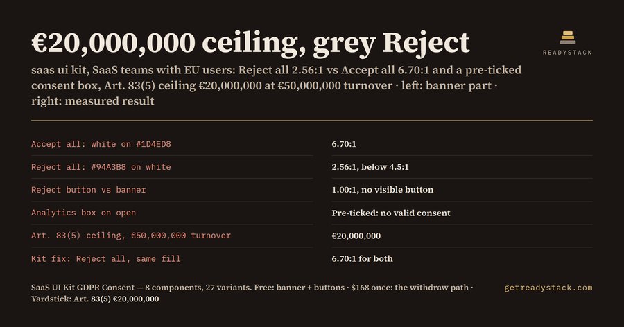
If your SaaS product has users in the EU, your cookie banner is a legal document drawn in pixels. GDPR Art. 7 sets the conditions for consent, and Art. 83(5) puts breaches of those conditions in the top fine band: up to €20,000,000, or 4% of total worldwide annual turnover of the preceding financial year, whichever is higher.
Most banners fail in the same three places, and all three are visible in a design file before a line of code is written.
The first is the Reject button. A common pattern is a solid blue Accept all button next to a grey text link for Reject. We measured one such pair: white on #1D4ED8 for Accept is 6.70:1, while a #94A3B8 grey label on a white banner is 2.56:1. The Reject button itself has no fill at all, so its shape against the banner is 1.00:1: there is no visible button. The EDPB Cookie Banner Taskforce, in its report of 17 January 2023, listed deceptive button colours and deceptive button contrast among the practices it examined. It did not set a single contrast number; it said each banner is judged case by case, and that a reject option whose text is barely readable can be manifestly misleading. WCAG 2.2 AA asks 4.5:1 for normal text, which is a useful yardstick even though it is not the legal test.
The second is the pre-ticked box. Recital 32 of the GDPR says silence, pre-ticked boxes or inactivity should not constitute consent, and the taskforce confirmed that pre-ticked opt-in boxes on the second layer do not lead to valid consent. In a design file this is one state: the default of every optional purpose must be Off.
The third is the part after the banner. Art. 7(3) says it shall be as easy to withdraw as to give consent. The taskforce pointed to a small, permanently visible icon or a link in a standard place that brings the user back to their privacy settings. Free banner generators stop at the first layer, so the settings page, the purpose toggles and the withdraw entry point are usually drawn late, by someone else, in a different style.
What the ceiling means for you depends on your turnover. At €50,000,000 of worldwide turnover, 4% is €2,000,000, so the €20,000,000 figure is the higher one and is your ceiling. At €800,000,000, 4% is €32,000,000, which becomes the ceiling. These are statutory maximums, not predictions, but they tell you which band the consent flow sits in.
We built a free check for exactly this. You type your banner background, the fill and label colour of Accept all and Reject all, whether the analytics box opens ticked, and your turnover. It returns both label contrasts, whether Reject is weaker than Accept, whether Reject has a visible button at all, a pre-tick flag and your Art. 83(5) ceiling. Nothing is sent anywhere; it runs in your browser.
The free Figma part is complete on its own: the cookie banner in 3 variants (first layer, second layer, choices saved) and the consent button in 4 variants, where Reject all uses the same fill, size and contrast as Accept all. The full SaaS UI kit adds the rest of the path: purpose toggles that start Off, unticked sign-up opt-ins with an error state, privacy-centre tabs, consent alerts, purpose badges and a floating Privacy settings chip. That is 8 components and 27 variants, every label contrast measured, the lowest at 5.91:1.
It ships as a .sketch file you drag into Figma, SVGs you paste as vectors, and a small plugin that draws every variant as a named frame. Some component structure is simplified on import, and Sketch users open the same file. Check your own banner first, for free.